

20 Personal Logo Examples to Inspire Your Brand Design
TABLE OF CONTENTS


TL;DR
- ✅ 20 personal logo examples across 4 styles: monograms, illustrated logos, wordmarks, and minimalist designs
- ✅ Five practical design tips for making your logo work at every size and on every surface
- ✅ FAQ covering cost, what a personal logo should include, and when to hire a designer
For solopreneurs, coaches and many other professions where personal branding matters, personal logo is often the first thing a potential client sees. It signals professionalism, hints at your style, and makes you instantly recognisable across your website, email signature, portfolio, and business cards.
Most personal logo advice tells you what to do without showing you what good looks like. So we collected 20 personal logo examples from graphic designers, illustrators, photographers, and other creative professionals to show you what works and why.
Before diving in, four principles the best personal logo examples on this list share:
- The logo suits the owner's expertise and industry
- It communicates what makes them different
- It feels true to their personality
- Their name appears in some recognizable form
{{LOGOS_PORTFOLIO="/dev/components"}}
What is a personal logo?
A personal logo is a visual mark that represents an individual rather than a company. It typically incorporates the person's name or initials and is designed to communicate their professional identity at a glance.
Personal logos are used by freelancers, graphic designers, photographers, coaches, consultants, and solopreneurs who want a professional identity that travels with them. Unlike a corporate logo, a personal logo leads with the person: their name, their style, their niche.
The most common formats are monograms (initials-based marks), wordmarks (your full name as typography), illustrated logos (custom imagery), and minimalist marks (abstract or geometric initials). You'll see all four in the examples below. For a full breakdown of types of logo designs, that guide covers each format in depth.
1. Keller Biolo
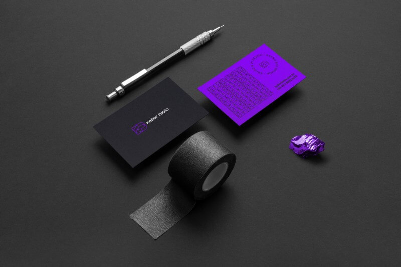
This professional designer and art director's logo is a textbook monogram done right. The cool colour palette, subtle pattern, and simple lettermark combine to feel modern without being trendy, and the mark stays legible at any size.
2. Regina Julian
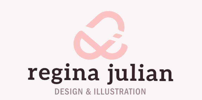
For a graphic designer, a logo is a direct testament to their skills. Regina Julian infused her initials R and J with a paperclip and heart: a visual metaphor for bringing design elements together with care. Look closely and you'll catch it.
3. Giuliane Cerón
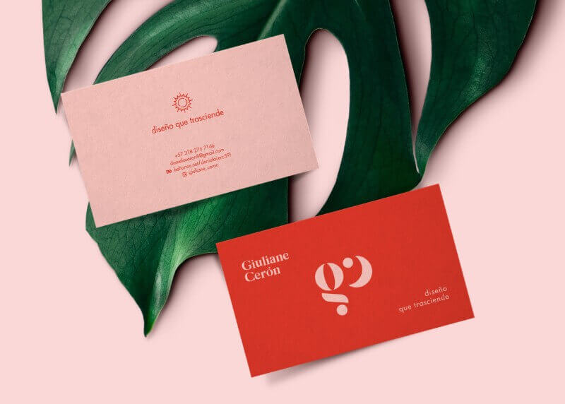
This creative monogram uses circular shapes to form the lowercase letters g and c, the artist’s initials. The tagline says: “Design that transcends”, and fittingly, the monogram looks like a moon in different lunar phases.
4. Joanne Mac
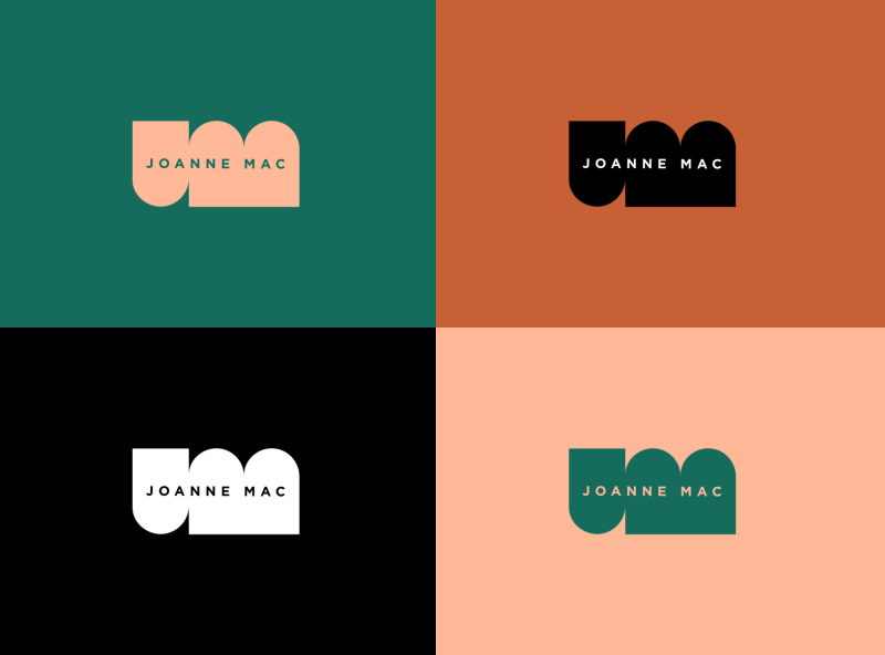
This simple and very trendy monogram belongs to the graphic designer Joanne Mac. The semi-circular shapes form the negative space around the letters J and M, and her full name is added for extra visibility.
5. Amanda Marie
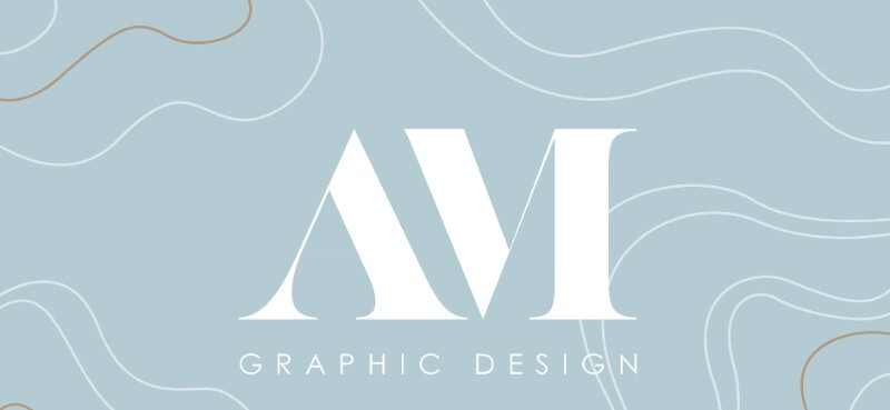
Classic serif lettering makes up the base of Amanda Marie's monogram. The initials paired with the label "Graphic Design" make the professional niche immediately clear. No explanation needed.
6. Ingrid Delgado
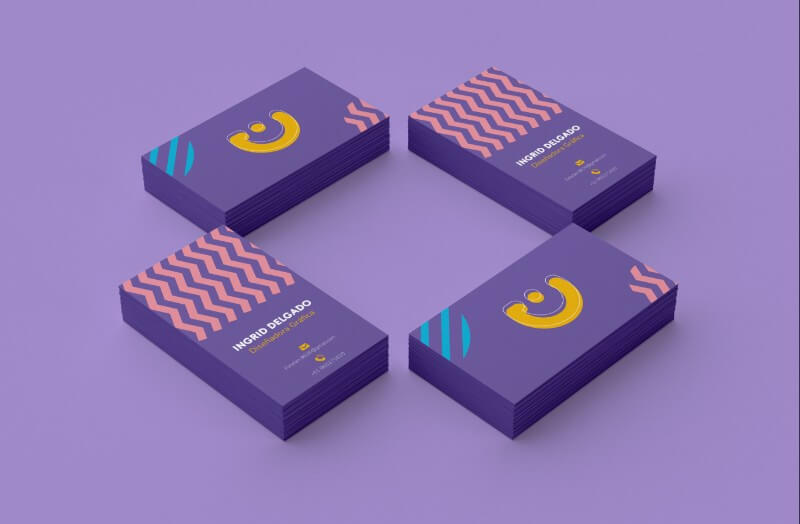
This mark combines lowercase i and uppercase I into a compact logo in a rich, youthful color palette. It works equally well on business cards and digital formats.
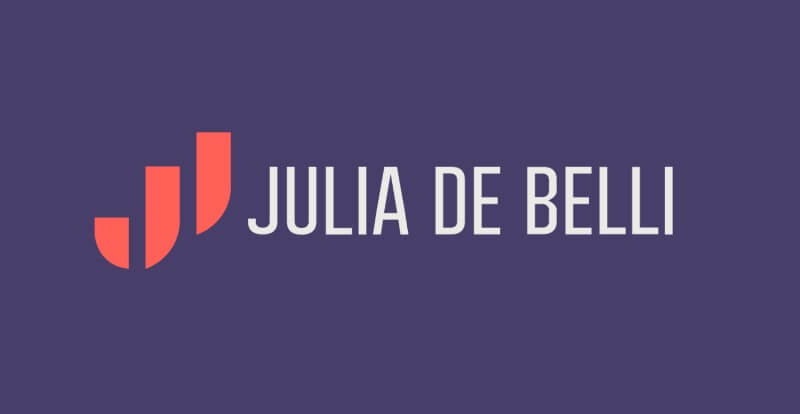
7. Julia De Belli
Depending on the angle, this abstract form reads as either a J or a B. Julia De Belli's mark is a masterclass in negative space: a logo that rewards attention without requiring it.
Illustrated personal logos
An illustrated personal logo uses custom imagery to communicate your style and expertise in a single mark. It's the right choice when your work is visual and your personality is the selling point. Illustrators, photographers, and animators reach for this format most often. The trade-off is scalability: illustrated logos need more care at small sizes, so they're usually paired with a simpler monogram or wordmark version for use at favicon or print size.
8. Geraldine Nunez
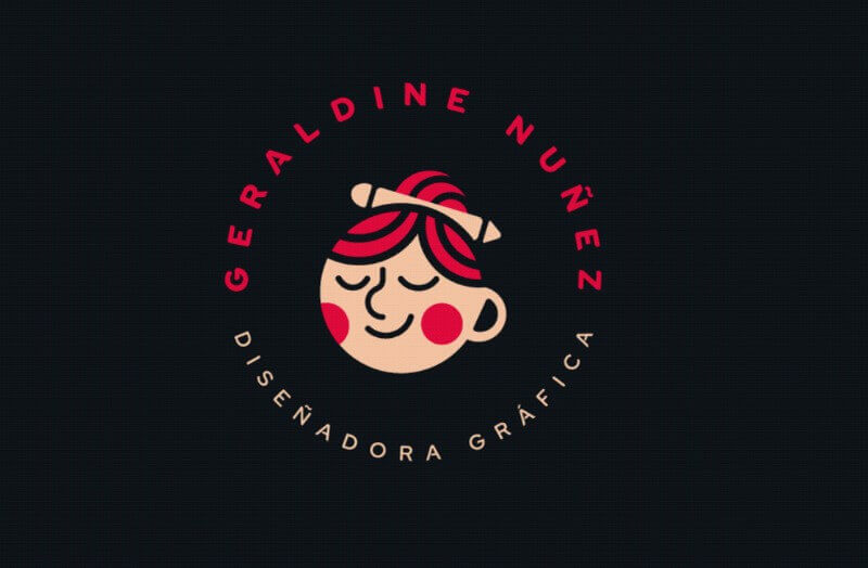
This logo designer and illustrator set out to show her skills, personality, and likes in a single mark. The result is a consistent, illustrated identity that feels personal without being precious.
9. Kristen Mah
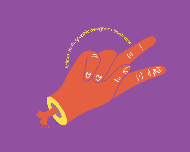
What looks like a peace sign is actually the letter K in sign language: Kristen's first initial. This illustrated logo rewards a second look, which is exactly what a good illustrated mark should do. It also doubles as a conversation starter.
10. Alana
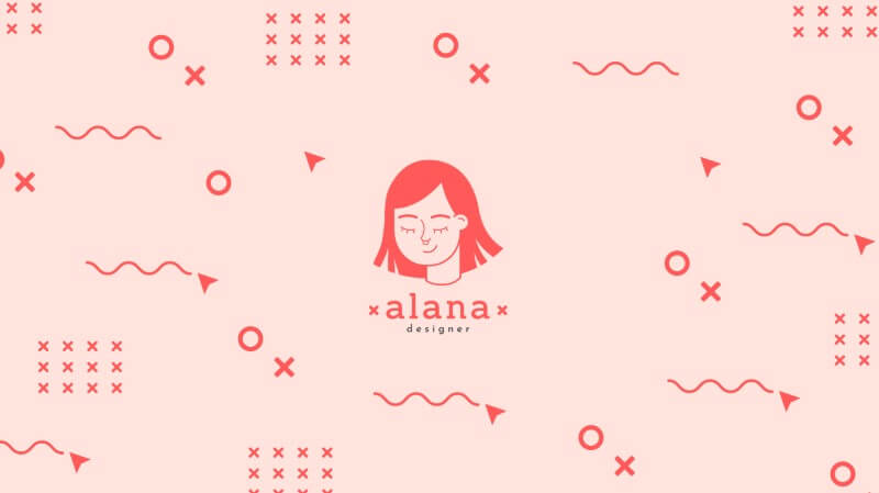
Alana used a portrait illustration of herself as her logo, in bright colours that match her illustration style. If your work has a signature visual approach, your logo is the fastest way to demonstrate it before anyone sees the portfolio
11. Lorik Khodaverian
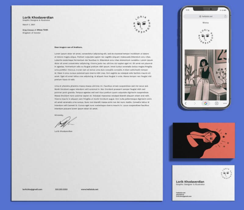
Lorik Khodaverian's logo frames a portrait of herself inside her own name. Part emblem, part signature. Illustrators with a distinctive portrait style should note this approach: it turns your signature subject into your identity.
12. Lina Figueroa
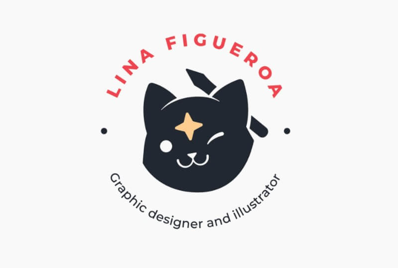
A cat with a pen and a North Star sounds maximalist, but Lina's logo pulls it off through simplicity of line and a restrained colour palette. Each element earns its place: the cat for independence, the pen for illustration, the star for direction. When every detail has a reason, illustrated logos work.
Wordmark and logotype logos
A wordmark or logotype logo is purely typographic: your name, styled as a logo. No symbol, no icon. It works best when your name is short and distinctive, when you want maximum flexibility across applications, or when recognition is built around your name rather than a visual mark. Coaches, consultants, speakers, and solopreneurs building a personal brand reach for this format most often because it's the most direct path to name recognition.
13. Juan Leite
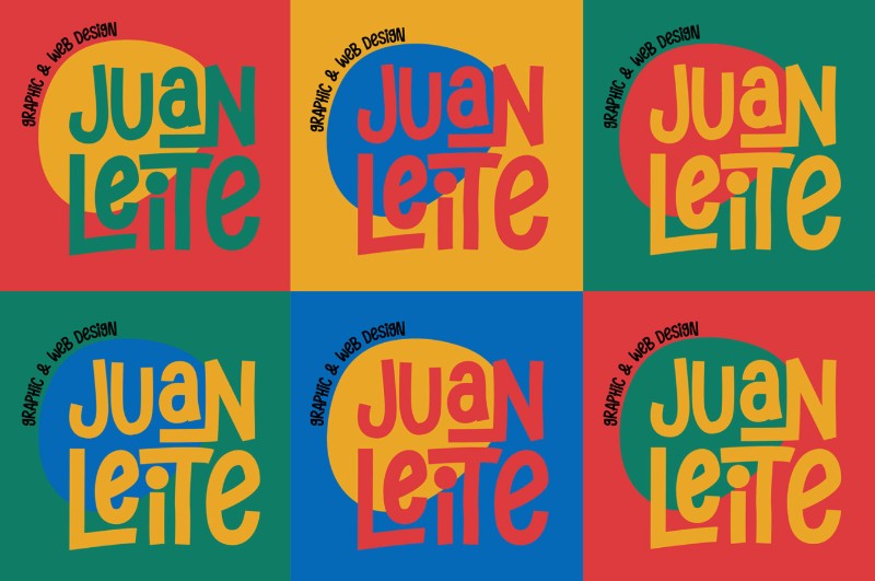
Drawing from pop culture, art, and the 90s, Juan Leite created a wordmark that holds up across colour schemes without losing consistency. This is the versatility of a well-crafted logotype on full display.
14. Joaquin da Silva
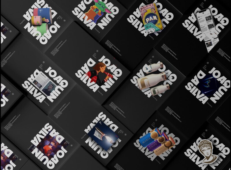
This dynamic logo uses the designer's name as a frame: inside it, he places all his personal and client work, turning his identifier into an ever-evolving portfolio highlight. It's one of the more inventive uses of a logotype we've seen.
15. MaPa
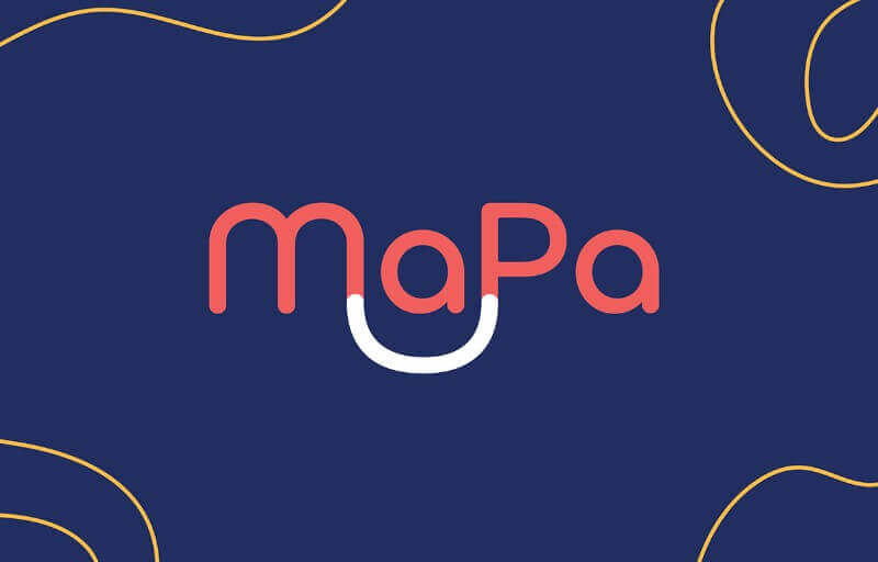
Combining the first syllables of Maria Paula's names, this logotype works equally well on a personal website, a presentation deck, or a social media profile. Proof that wordmarks don't need to be complicated to be effective.
16. Julieta Sorgen
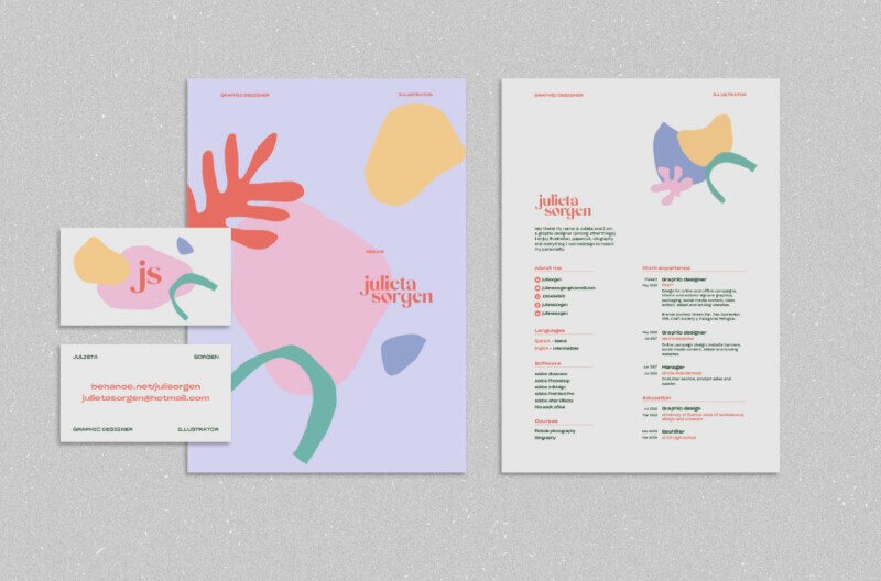
The tilted Os give Julieta Sorgen's logotype a chic dynamic energy without sacrificing simplicity. One small typographic decision, applied consistently, is enough to make a wordmark impossible to forget.
Minimalist personal logos
Minimalist personal logos reduce everything to a single shape, letter combination, or geometric mark. When it works, the result is instantly recognisable and endlessly flexible. The constraint is that simple does not mean generic. A minimalist logo has to be memorable at a glance, or it disappears into the background. The four examples below show what that balance looks like in practice.
17. Facundo Samman
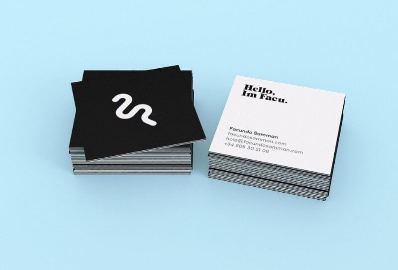
A wavy form built from the designer's initials reflects his love of surfing. This logo layers meaning into a simple shape: it reads as initials, it reads as a wave, and both readings reinforce the person behind it.
18. Tara Nisha
The letters T and N interlace into a minimal logomark that's almost brutalist in its directness. No ornament, no colour, no room for misreading. If you want stripped-down minimalism, this is what it looks like done well, Tara Nisha’s personal logo is a good one to learn from.
19. Daniel Rotter
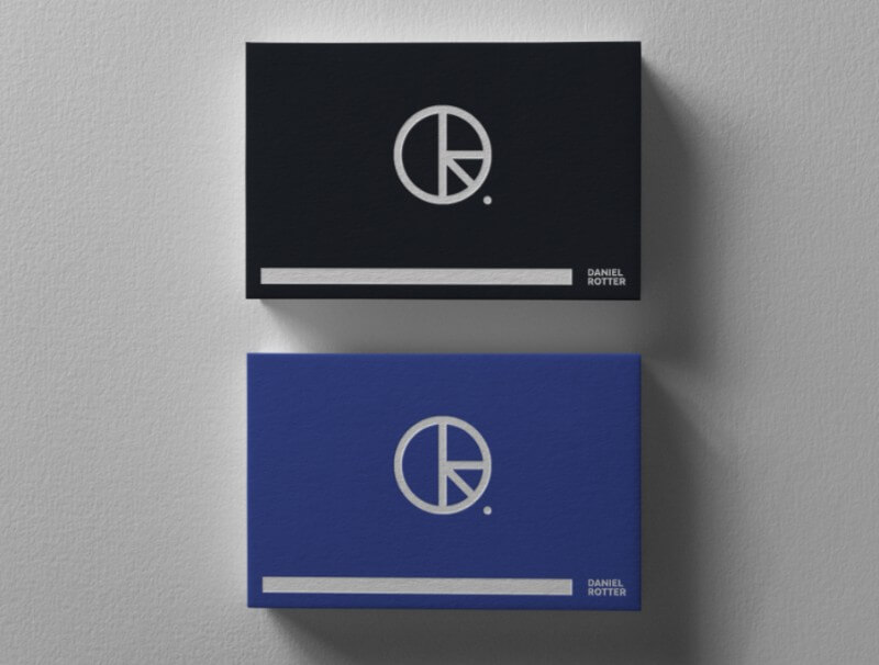
This German designer's initials sit inside a circle with carefully proportioned geometry. The result feels modern without being trendy, and the circular container adapts to print and digital formats without modification.
20. Dunja Milosev
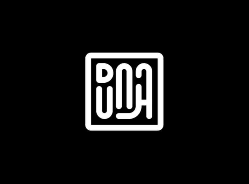
This mark looks like a rune, but it's the artist's name inside a square frame. It was a logo idea she was exploring, not her officially adopted logo. But it shows exactly how far you can push minimalism before a logo stops being a logo and becomes just a shape.
What makes a great personal logo?
Looking at 20 personal logo examples makes patterns visible that are harder to articulate in theory. In our experience working on 150,000+ design projects, the personal logos that stick share five traits that have nothing to do with style or trend.
1. Your name has to be legible in some form
Abstract marks work for global brands with massive marketing budgets. For a personal logo, your name or initials need to be present and readable. Even the most abstract logos above anchor to a letter or a name. If someone has to ask "what does that say?", the logo isn't working. Consider pairing any abstract mark with a well-chosen font for your full name below it.
2. Match your industry's visual conventions
A law firm logotype and an illustrator's character logo communicate very differently on purpose. Before designing, look at logos from people in your field. You don't want to copy them, but you do want your logo to feel at home in your professional context. A photographer's logo that reads like a law firm's mark is sending the wrong signals to the wrong people.
3. Test it at favicon size before committing
Your logo will appear at 16x16 pixels in a browser tab, 50x50 pixels in an email footer, and 500x500 pixels on your website header. Design for the smallest version first. If the detail disappears at small sizes, simplify. This is why illustrated logos almost always need a companion monogram or wordmark for small-format use.
4. Limit yourself to two colours
A personal logo needs to work on white backgrounds, dark backgrounds, and single-colour print. The more colours you add, the harder it is to maintain consistency across contexts. Most of the strongest personal logo examples above use one or two colours. Start in black and white, then introduce colour. Our guide to logo colour palettes covers combinations that hold up across every format.
5. Reflect your actual style, not your ideal style
Your logo is a preview of what it's like to work with you. If your work is clean and minimal, your logo should be clean and minimal. If your illustrations are expressive and warm, a cold geometric mark sends a confusing signal. The best personal logos in this list feel inevitable: you look at them and think, of course that's what this person's logo looks like.
For more on the design principles behind these decisions, see our overview of logo design trends and our step-by-step guide on how to create a logo.
Frequently asked questions
Need a personal logo - we can help!
We hope this list of great personal logo examples give you plenty of food for thought.
Whether it’s a creative custom typography, a fun illustration, or brilliant minimalist approach to a complex idea - a great logo requires a professional design service.
The cost of a logo can range anywhere from $500 to tens of thousands of dollars. Luckily, there’s no need to pay the big bucks or wonder what your personal brand logo will cost.
Try our unlimited brand design services and get everything your personal brand needs - from a great logo, to a website, business cards, social media graphics, and much more.
Get started today with unlimited requests and revisions, for as little as $549 a month. Or get in touch with us for a chance to tell us about your design needs.

Journalist turned content writer. Based in North Macedonia, aiming to be a digital nomad. Always loved to write, and found my perfect job writing about graphic design, art and creativity. A self-proclaimed film connoisseur, cook and nerd in disguise.

Top-quality designers
A complete creative team at your fingertips: graphic and web designers, illustrators, and more.

Lightning-fast turnaround
Get start today and receive your first update on the next business day.

All-inclusive pricing
Unlimited requests and revisions. One flat monthly fee. No surprises.

Flexible & scalable model
No contract. Scale up and down as needed. Pause or cancel at anytime.
Continue reading

Explore some of our best designs
Get inspired by a curated selection of ManyPixels work. Download the portfolio to see what our team can create.


